Great question came through the ether from Holger on waterfall charts last night.
"I know that Answers supports waterfall charts and BI Publisher does not.
Do you have a different solution approach for waterfall charts with BI Publisher (perhaps stacked bars with white areas)?
Maybe you have already implemented something similar in the past and you can send me an example."
I didnt have one to hand, but I do now. Little known fact, the Publisher chart engine is based on the Oracle Reports chart engine. Therefore, this document came straight to mind. Its awesome for chart tips and tricks. Will you have to get your hands dirty in the chart code? Yep. Will you get the chart you want with a little effort? Yep. Now, I know, I know, in this day and age, you should get waterfalls with no effort but then you'd be bored right?![]()
First things first, for the uninitiated, what is a waterfall chart? From some kind person at Wikipedia, "The waterfall chart is normally used for understanding how an initial value is affected by a series of intermediate positive or negative values. Usually the initial and the final values are represented by whole columns, while the intermediate values are denoted by floating columns. The columns are color-coded for distinguishing between positive and negative values."
We'll get back to that last sentence later, for now lets get the basic chart working.
Checking out the Oracle Report charting doc, search for 'floating' their term for 'waterfall' and it will get you to the section on building a 'floating column chart' or in more modern parlance, a waterfall chart. If you have already got your feet wet in the dark arts world of Publisher chart XML, get on with it and get your waterfall working.
If not, read on.
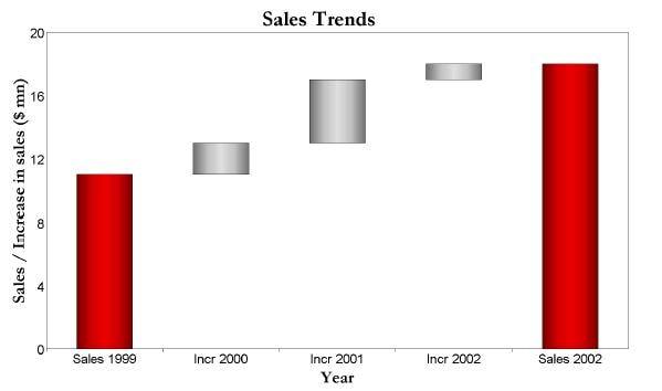
![]() When I first starting looking at this chart, I decided to ignore the 'negative values' in the definition above. Being a glass half full kind of guy I dont see negatives right :)
When I first starting looking at this chart, I decided to ignore the 'negative values' in the definition above. Being a glass half full kind of guy I dont see negatives right :)
Without them its a pretty simple job of rendering a stacked bar chart with 4 series for the colors. One for the starting value, one for the ending value, one for the diffs (steps) and one for the base values. The base values color could be set to white but that obscures any tick lines in the chart. Better to use the transparency option from the Oracle Reports doc.
<Series id="0" borderTransparent="true" transparent="true"/>
Pretty simple, even the data structure is reasonably easy to get working. But, the negative values was nagging at me and Holger, who I pointed at the Oracle Reports doc had come back and could not get negative values to show correctly. So I took another look. What a pain in the butt!
In the chart above (thats my first BIP waterfall maybe the first ever BIP waterfall.) I have lime green, start and finish bars; red for negative and green for positive values. Look a little closer at the hidden bar values where we transition from red to green, ah man, royal pain in the butt! Not because of anything tough in the chart definition, thats pretty straightforward. I just need the following columns START, BASE, DOWN, UP and FINISH.
START 200
BASE 0
UP 0
DOWN 0
FINISH 0
| START 0
BASE 180
UP 0
DOWN 20
FINISH 0
| START 0
BASE 150
UP 0
DOWN 30
FINISH 0 |
|
Bar 1 - Start Value
| Bar 2 - PROD1
| Bar 3 - PROD2
|
|
and so on. The start, up, down and finish values are reasonably easy to get. The real trick is calculating that hidden BASE value correctly for that transition from -ve >> + ve and vice versa. Hitting Google, I found the key to that calculation in a great page on building a waterfall chart in Excel from the folks at Contextures. Excel is great at referencing previous cell values to create complex calculations and I guess I could have fudged this article and used an Excel sheet as my data source. I could even have used an Excel template against my database table to create the data for the chart and fed the resulting Excel output back into the report as the data source for the chart. But, I digress, that would be tres cool thou, gotta look at that.
On that page is the formula to get the hidden base bar values and I adapted that into some sql to get the same result.
Lets assume I have the following data in a table:
| PRODUCT_NAME | SALES |
| PROD1 | -20 |
| PROD2 | -30 |
| PROD3 | 50 |
| PROD4 | 60 |
The sales values are versus the same period last year i.e. a delta value. I have a starting value of 200 total sales, lets assume this is pulled from another table.
I have spent the majority of my time on generating the data, the actual chart definition is pretty straight forward. Getting that BASE value has been most tricksy!
I need to generate the following for each column:
PRODUCT_NAME | STRT | BASE_VAL | DOWN | UP | END_TOTAL |
START
| 200
| 0
| 0
| 0
| 0
|
PROD1
| 0
| 180
| 20
| 0
| 0
|
PROD2
| 0
| 150 | 30 | 0
| 0
|
PROD3
| 0 | 150 | 0 | 50 | 0 |
PROD4
| 0 | 200
| 0 | 60 | 0 |
END
| 0 | 0 | 0 | 0 | 260
|
Ignoring the START and END values for a second. Here's the query for the PRODx columns:
 SELECT 2 SORT_KEY
, PRODUCT_NAME
, STRT
, SALES
, UP
, DOWN
, 0 END_TOTAL
, 200 + (SUM(LAG_UP - DOWN) OVER (ORDER BY PRODUCT_NAME)) AS BASE_VAL
FROM
(SELECT P.PRODUCT_NAME
,  0 AS STRT
, P.SALES
, CASE WHEN P.SALES > 0 THEN P.SALES ELSE 0 END AS UP
, CASE WHEN P.SALES < 0 THEN ABS(P.SALES) ELSE 0 END AS DOWN
, LAG(CASE WHEN P.SALES > 0 THEN P.SALES ELSE 0 END,1,0)
      OVER (ORDER BY P.PRODUCT_NAME) AS LAG_UP
FROM PRODUCTS P
)
The inner query is breaking the UP and DOWN values into their own columns based on the SALES value. The LAG function is the cool bit to fetch the UP value in the previous row. That column is the key to getting the BASE values correctly.
The outer query just has a calculation for the BASE_VAL.
200 + (SUM(LAG_UP - DOWN) OVER (ORDER BY PRODUCT_NAME))
The SUM..OVER allows me to iterate over the rows to get the calculation I need ie starting value (200) + the running sum of LAG_UP - DOWN. Remember the LAG_UP value is fetching the value from the previous row.
Is there a neater way to do this? Im most sure there is, I could probably eliminate the inner query with a little effort but for the purposes of this post, its quite handy to be able to break things down.
For the start and end values I used more queries and then just UNIONed the three together. Once note on that union; the sorting. For the chart to work, I need START, PRODx, FINISH, in that order. The easiest way to get that was to add a SORT_KEY value to each query and then sort by it. So my total query for the chart was:
SELECT 1 SORT_KEY
, 'START' PRODUCT_NAME
, 200 STRT
, 0 SALES
, 0 UP
, 0 DOWN
, 0 END_TOTAL
, 0 BASE_VAL
FROM PRODUCTS
UNION
SELECT 2 SORT_KEY
, PRODUCT_NAME
, STRT
, SALES
, UP
, DOWN
, 0 END_TOTAL
, 200 + (SUM(LAG_UP - DOWN)
      OVER (ORDER BY PRODUCT_NAME)) AS BASE_VAL
FROM
(SELECT P.PRODUCT_NAME
,  0 AS STRT
, P.SALES
, CASE WHEN P.SALES > 0 THEN P.SALES ELSE 0 END AS UP
, CASE WHEN P.SALES < 0 THEN ABS(P.SALES) ELSE 0 END AS DOWN
, LAG(CASE WHEN P.SALES > 0 THEN P.SALES ELSE 0 END,1,0)
       OVER (ORDER BY P.PRODUCT_NAME) AS LAG_UP
FROM PRODUCTS P
)
UNION
SELECT 3 SORT_KEY
, 'END' PRODUCT_NAME
, 0 STRT
, 0 SALES
, 0 UP
, 0 DOWN
, SUM(SALES) + 200 END_TOTAL
, 0 BASE_VAL
FROM PRODUCTS
GROUP BY 1,2,3,4,6
ORDER BY 1
A lot of effort for a dinky chart but now its done once, doing it again will be easier. Of course no one will want just a single chart in their report, there will be other data, tables, charts, etc. I think if I was doing this in anger I would just break out this query as a separate item in the data model ie a query just for the chart. It will make life much simpler.
Another option that I considered was to build a sub template in XSL to generate the XML tree to support the chart and assign that to a variable. Im sure it can be done with a little effort, I'll save it for another time.
On the last leg, we have the data; now to build the chart. This is actually the easy bit. Sadly I have found an issue in the online template builder that precludes using the chart builder in those templates. However, RTF templates to the rescue!
Insert a chart and in the dialog set up the data like this (click the image to see it full scale.)
![]()
Its just a vertical stacked bar with the BASE_VAL color set to white.You can still see the 'hidden' bars and they are over writing the tick lines but if you are happy with it, leave it as is. You can double click the chart and the dialog box can read it no problem. If however, you want those 'hidden' bars truly hidden then click on the Advanced tab of the chart dialog and replace:
<Series id="1" color="#FFFFFF" />
with
<Series id="1" borderTransparent="true" transparent="true" />
and the bars will become completely transparent. You can do the #D and gradient thang if you want and play with colors and themes. You'll then be done with your waterfall masterpiece!
Alot of work? Not really, more than out of the box for sure but hopefully, I have given you enough to decipher the data needs and how to do it at least with an Oracle db. If you need all my files, including table definition, sample XML, BIP DM, Report and templates, you can get them here.


 I have ever considered. The title is a tenuous reference to a formatting feature that Adobe offers in their PDF documents.


 When I first starting looking at this chart, I decided to ignore the 'negative values' in the definition above. Being a glass half full kind of guy I dont see negatives right :)


